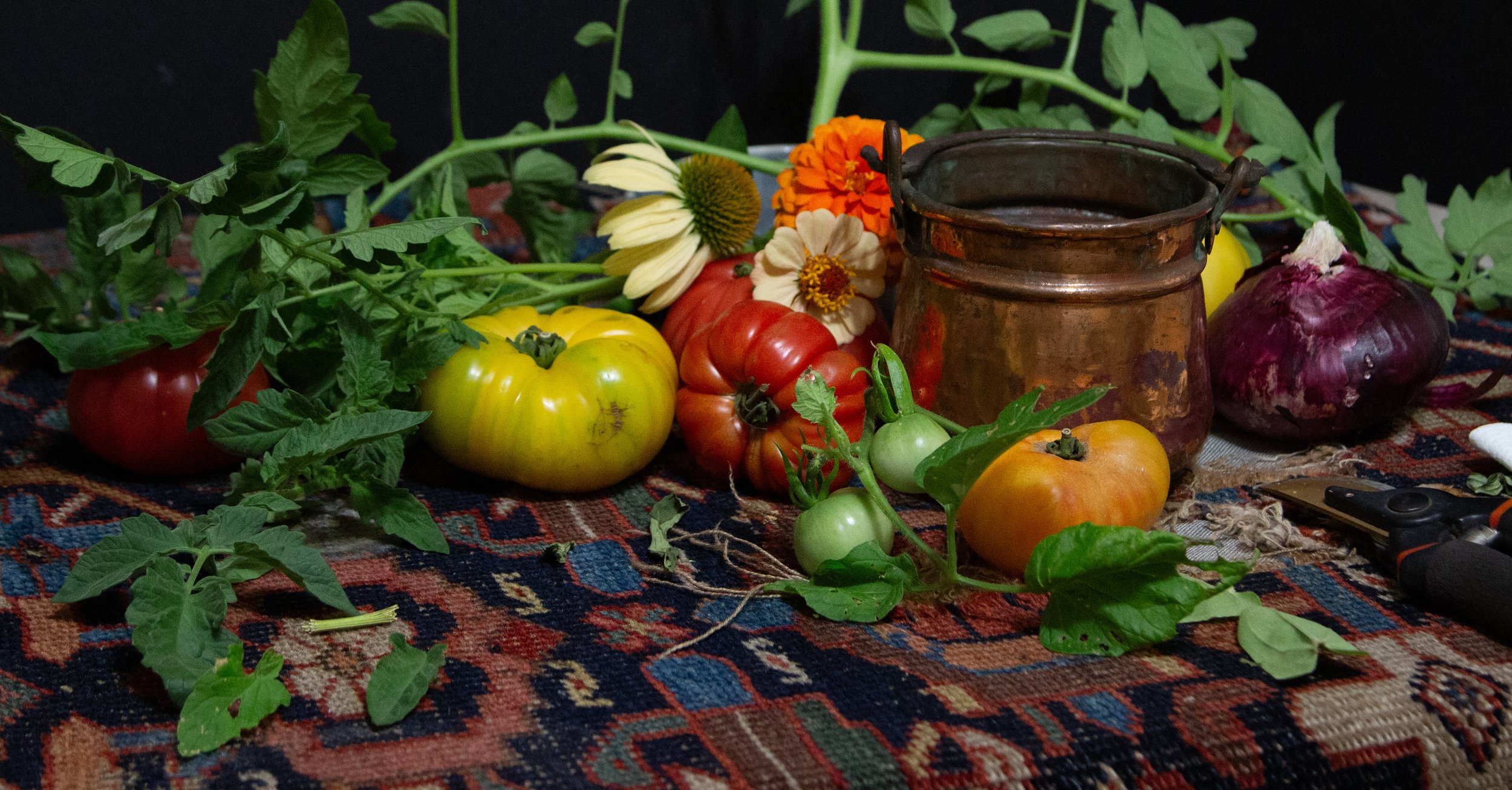
Admittedly, I bought most of these from the local market, BUT I do have several varieties growing in the garden, so I was able to add leaves and parts of the vine to my composition to add interest.
Enjoy scrolling through the steps and be sure to save this blog address for future reference!
-Daniel
LET’S BEGIN…
Once I’ve settled on an idea and the size I’d like to work with, I begin by arranging my subjects.
Now, anyone who knows or has taken a workshop with me has undoubtedly heard me say that composition is SUBJECTIVE and personal, and THERE ARE NO RULES! Any “rule” you might hear is simply someone’s opinion.
When it comes to my version of “good” design (the word “good” here simply refers to my taste), I like asymmetry and a strong focal area, with some secondary focal areas for a bit of balance. I also like to have “lead-ins” and “lead-outs” - things that go beyond the boundaries of my composition and therefore become cropped.
Here’s a picture of my initial set-up (you’ll notice in subsequent steps that I added to my final composition)…
I’m using sanded paper on board - UArt 400 grit.
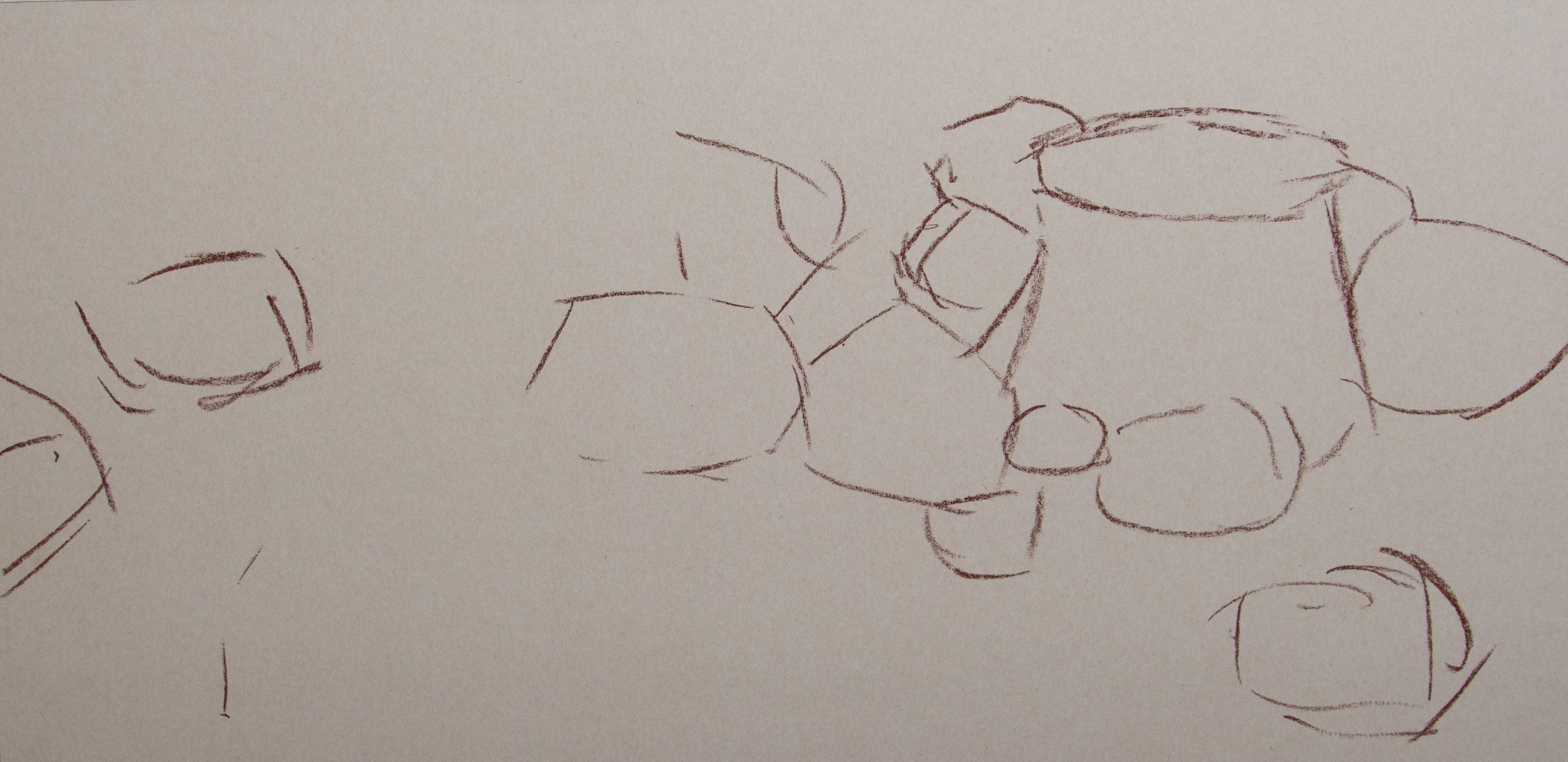
To begin, I’ve decided to add a few lines indicating the general placement of my major elements. Nothing detailed, just some marks to get the overall size and proportion of things before I start to lay down any color.
If you don’t know about “COMPARATIVE MEASURING” when it comes to drawing, I highly suggest you look it up and implement it into your own practice.
The next step is to get some pigment onto the surface. From my wide array of pastels I choose each stick not only for its color, but also its value (degree of lightness or darkness). This will allow me to get some valuable information down right away, and start me on a clear path moving forward. It’s important that I get things off to a good start, while applying only a MINIMAL amount of pigment for this first layer…
You can see in the above image that I’m not trying to cover all of the white surface - I’m just lightly blocking in each object with an approximate color and value, sometimes overlaying a few colors so they’ll mix and be closer to what I want.
This next step is my favorite, perhaps because it’s the only time I get to use a brush!
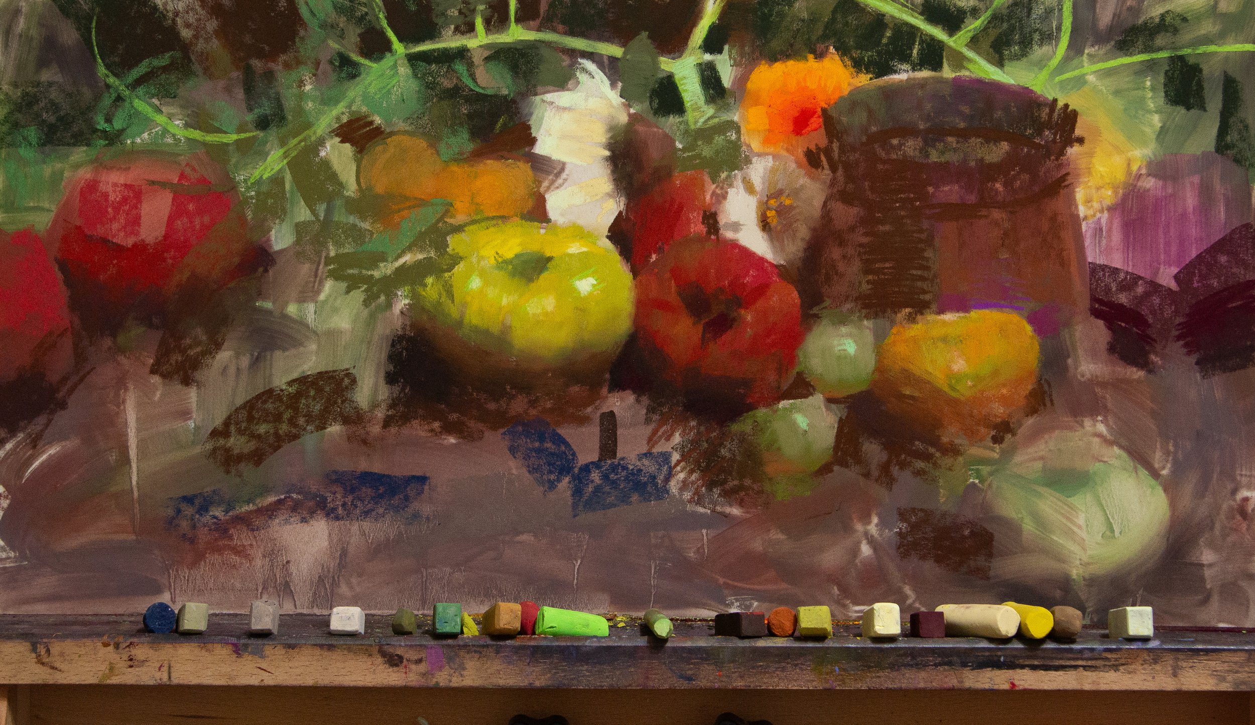
I apply rubbing alcohol with a wide flat brush to each area of the painting, being careful to keep the colors clean by not allowing too many to mix. I clean the brush with the alcohol and
This stage of the painting is very loose, and I allow things to get a bit wild. It’ll only tighten from here, so I find it best to let things do as they please, and have a bit of fun!
ABOVE: A close up of the painting just after the alcohol has been applied and begun to dry.
NOTE: The initial application of the rubbing alcohol will make things look much darker, but it will lighten as it dries.
Once the alcohol has completely evaporated, I can start applying more pigment, usually going to my focal areas first. It remains in what I think of as the “block-in” stage for a while longer as I move across the painting applying the larger masses of color but omitting details. Before I get caught up in nuance, I need the basics down: Overall color and value, light and shadow.
I can’t say enough about how important it is to stick with the basics while in the first few stages of a painting. It’s so easy to become caught up in a detail, nuance, or “flourish”, only to realize it’s wrong in some way and the entire painting suffers because of it. Your painting -just like a story, poem, song, or any other form of art- will be stronger and more successful if you give it a good solid foundation of accurate drawing, value, color, and edges, rather than some flourish or trick meant to convince everyone that you’re more skilled than you actually are.
Don’t rush through the fundamentals - they’re what hold everything together.
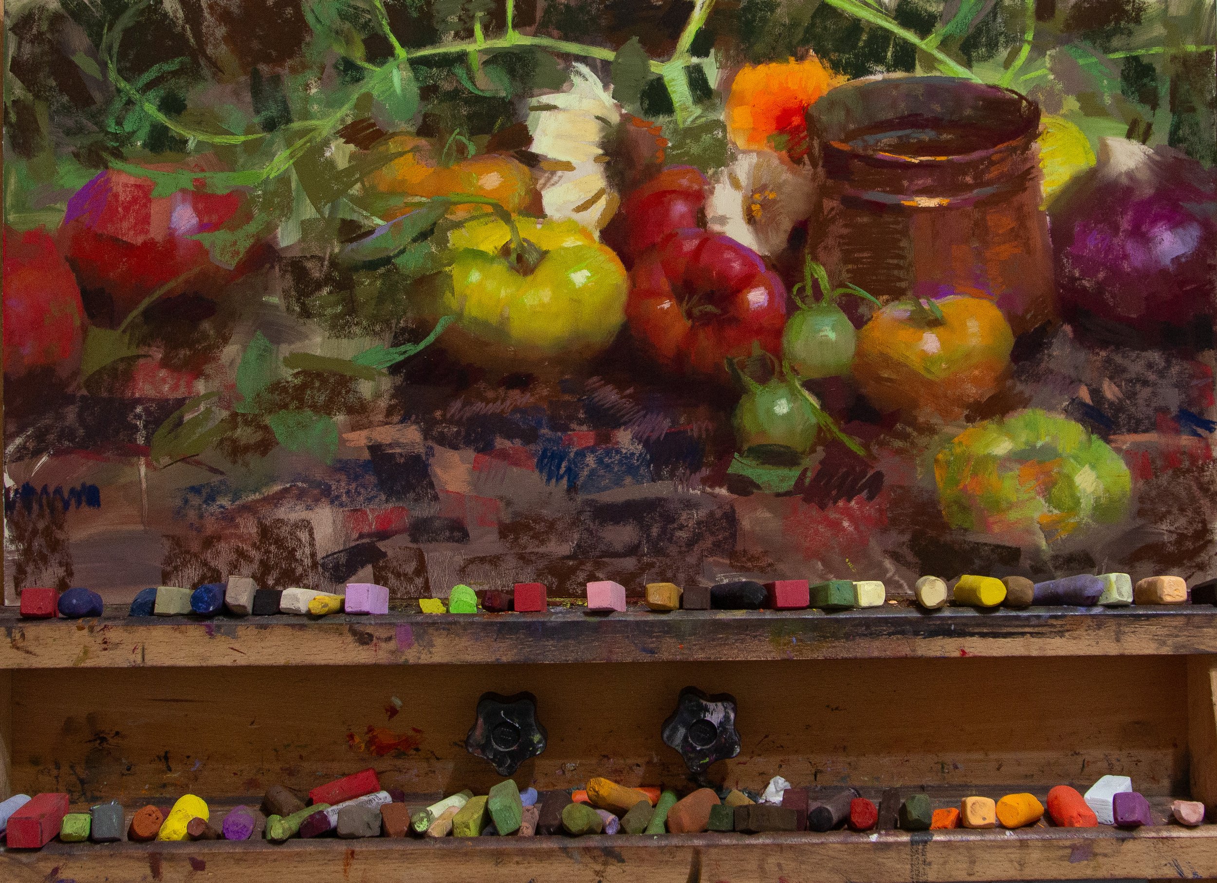
Now that I’ve added enough pigment to my surface, I can blend with my fingers if need be (without sanding my fingerprints off!), as well as through hatch-marks: Taking a stick of color and moving back and forth over an area in a single direction, followed by another color moving in another direction.
I’m also beginning to add details such as highlights, and nuances of color…
One of the most interesting lessons that I learned through painting with my friend, Richard Schmid, is how valuable temperature shifts can be. He explained how a form could be turned, not only by changing its value to be lighter or darker, but also (or instead) adjusting the color-temperature to be warmer or cooler.
By shifting the color around these tomatoes, I can indicate the turn of the form (the roundness) without changing the values!
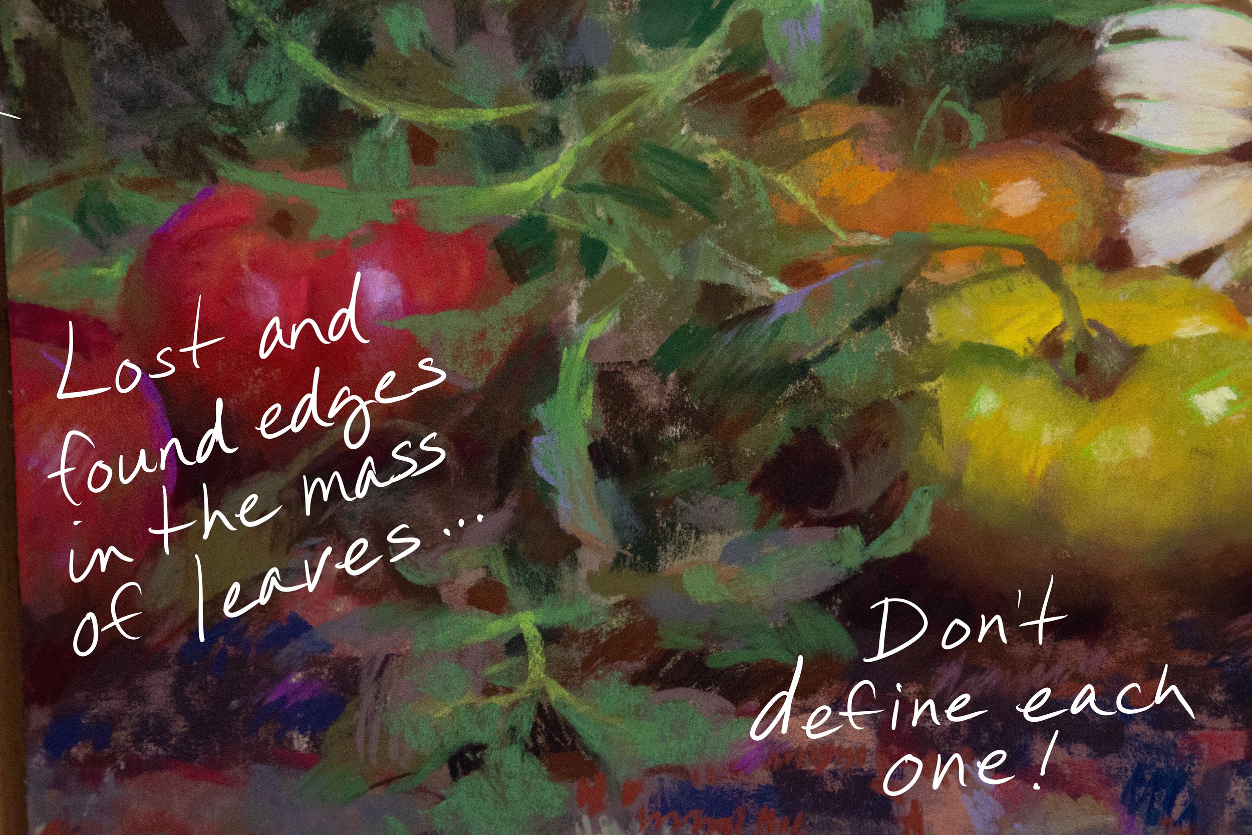
In my experience over the decades that I’ve been painting, I’ve noticed the impact that EDGES can have on a piece. Much as value and temperature shifts can create the illusion of form, edges add to the overall sense of depth and give a three-dimensional look to your subjects.
My general rule for edges is simple: Low contrast in value = softer (blended) edge - high value contrast = sharper/harder edge.
My edges are thus determined by how I set things up in my composition - where I want a sharpe edge, I place objects of a contrasting value together.
“Heirloom Tomatoes” 2023 - 12 x 24 inches, pastel
And there you have it! After developing my focal areas, I was careful not to over render some of the supporting elements such as the leaves, tapestry, and secondary tomatoes (there’s an onion in there too for good measure). This creates a “hierarchy” of sorts, and further emphasizes the parts of the painting that are more finished.
I hope you enjoyed seeing the process! And though the principles demonstrated here are applicable to any medium, if you haven’t tried your hand at soft pastels yet I highly recommend it. They’re great fun!


