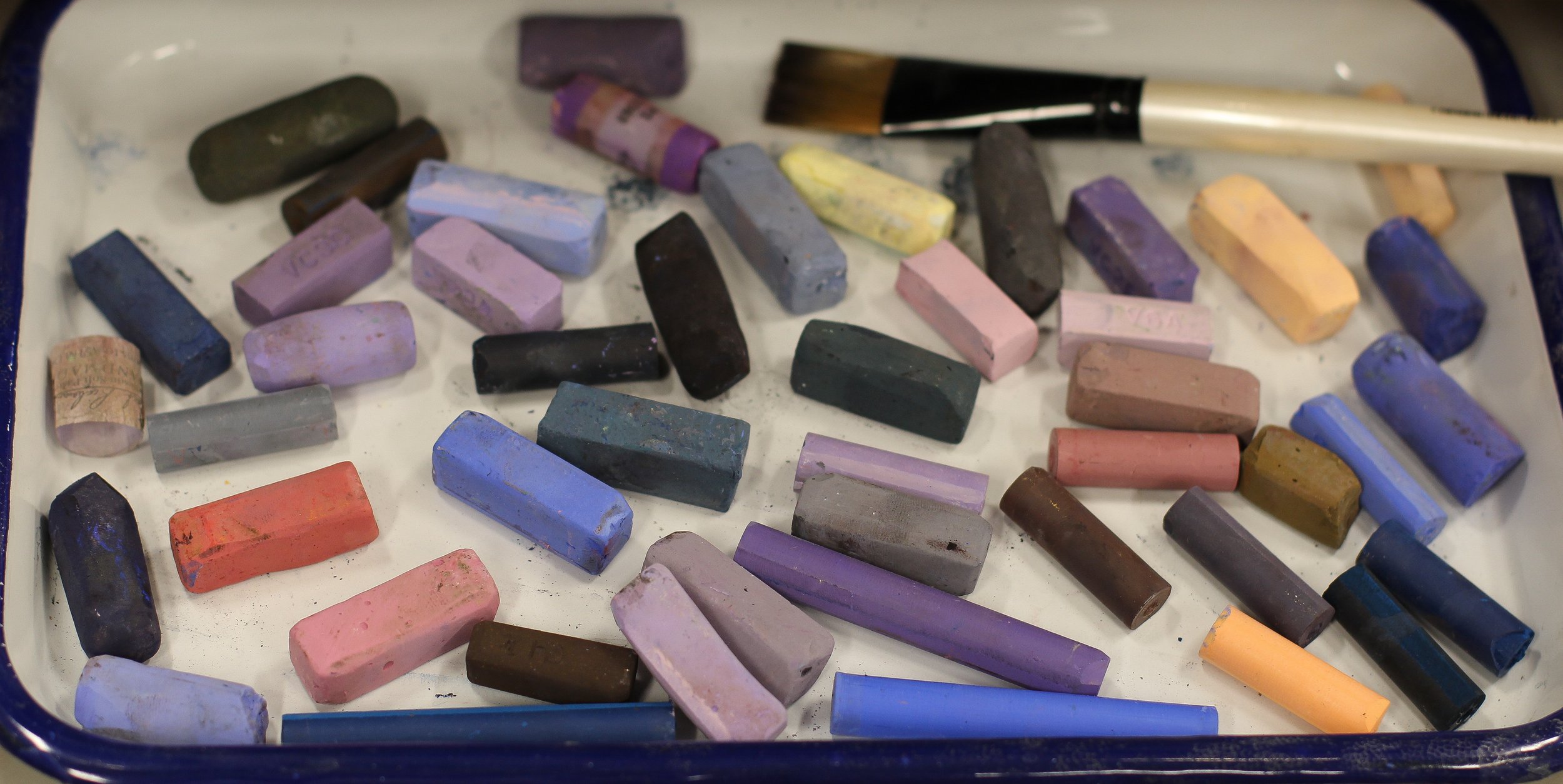
Along with the above mentioned brands of soft pastel, I like to use UArt paper on board, 400 grit. It’s a warm cream color, and has enough grit to grab the pigment even after several layers.
I’ll also be using pastel pencils -Caran d’Ache mostly- as well as rubbing alcohol, a soft synthetic flat brush (I don’t recommend using a favorite one - the surface is basically sand-paper and will wear down natural hairs), and some good paper towels (Viva are best).
LET’S BEGIN!
STEP 1
First, I like to select colors for each area that represent a large “mass”: an area large enough to warrant putting down an approximate color and value to represent it (details and nuances do not qualify for this and are thus left for later steps). I use some of the harder pastels for this step, such as Girault or Rembrandt, and use the broadside of the sticks for both efficiency of coverage as well as to create a looseness. I’m mindful not to put too much pigment down at this point, because the next step is where I’ll use the alcohol to create a wash, and it will move the small amounts of color around creating a more solid but transparent look. Too much pigment, and I won’t get the transparency that I like.
ABOVE: My start, using mostly medium to hard pastels
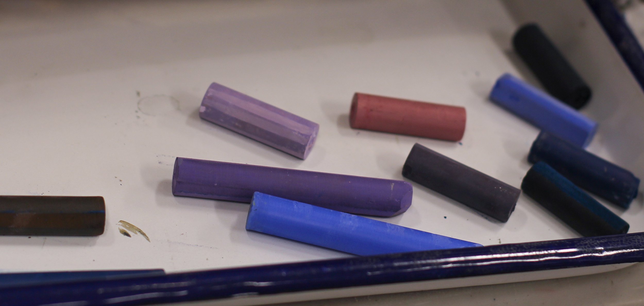
LEFT: The colors I began with.
ABOVE: A close-up of the application. Notice that I’m not attempting to cover all of the paper.
STEP 2
After my initial block-in, I’ll put out some alcohol in a small jar. I don’t need too much -just enough to soak my brush a few times, plus some for cleaning it while going back and forth between color/value areas- but I do like to really saturate the pigments and move them around freely. This is the only portion where I feel like I’m “really painting” and I like to keep things as loose as possible.
My reason for choosing alcohol is that it has a fast drying time. It evaporates in mere minutes, especially if the studio is warm, and this allows me to move on to the next step rather quickly. Of course, other solvents would work just fine, or even water, but they require much more time to fully dry.
Whatever liquid you choose, once dry, whatever pigment it mixed with becomes settled into the paper. This allows for subsequent layers to go on top without blending in to your wash.
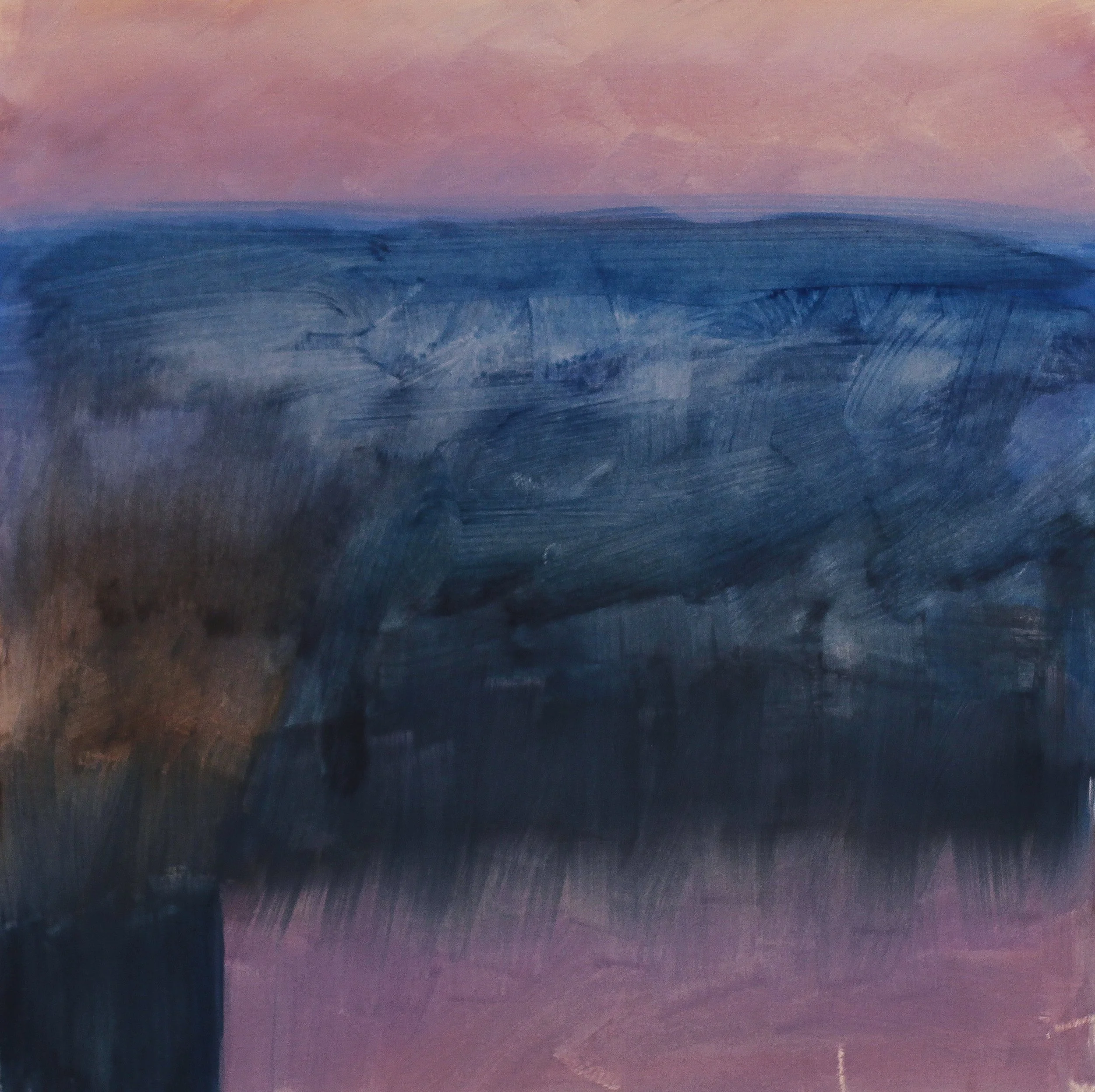
ABOVE: After the initial wash of alcohol.
ABOVE: A close up of the brushwork once dry.
STEP 3
Once the alcohol has completely evaporated and the surface is totally dry to the touch, I can begin adding the next layer of color. You’ll know that the surface is dry not only by feeling it with your finger, but because it will also lighten considerably and become dull. Initially, when the alcohol is first applied, things will look too dark. Don’t be alarmed! This is perfectly normal.
This next layer of color will include many or most of the colors that I chose at the beginning, and I’ll even apply them in a similar way - using the broad side and not applying pigment too heavily.
ABOVE: Beginning to apply a layer of color, starting from the top.
ABOVE: A close-up.
ABOVE: Continuing down the composition and blocking in smaller shapes such as the chimneys and roof lines.
STEP 4
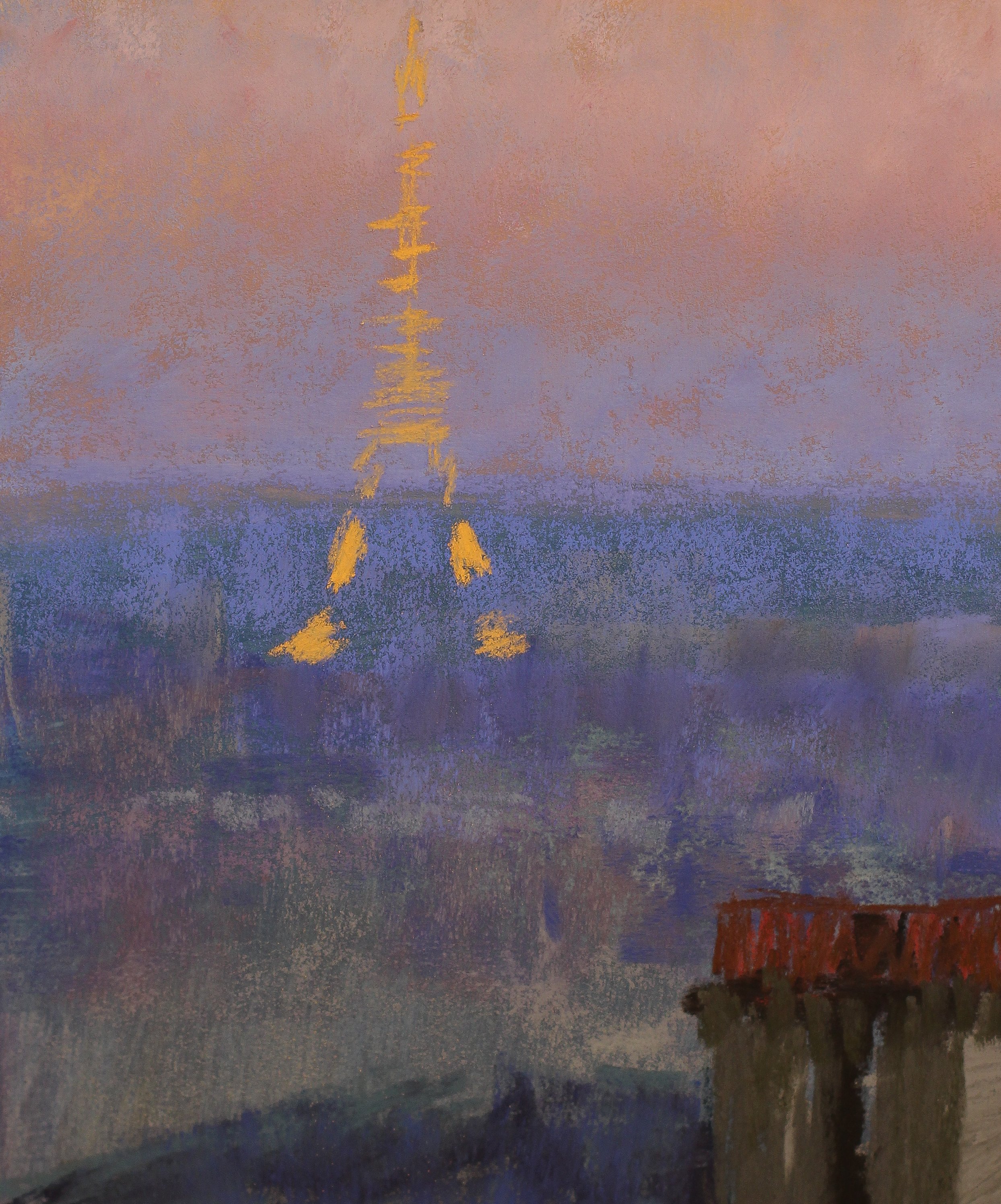
Next, I’m going to take a bit of time and block in the Eiffel Tower. It’s a “detail” rather than a large mass, but I’m confident that most would agree, it’s QUITE the detail and worthy of early placement!
I still haven’t brought out the pastel pencils by this point, and didn’t feel it was necessary while blocking in the tower either. Pencils are wonderful for getting a nice sharp edge or fine line, but the temptation to “tighten” things up while using them is difficult to avoid. I find it’s best to use the larger more primitively shaped pastel sticks for as long as possible, and save the refining for later on in the process.
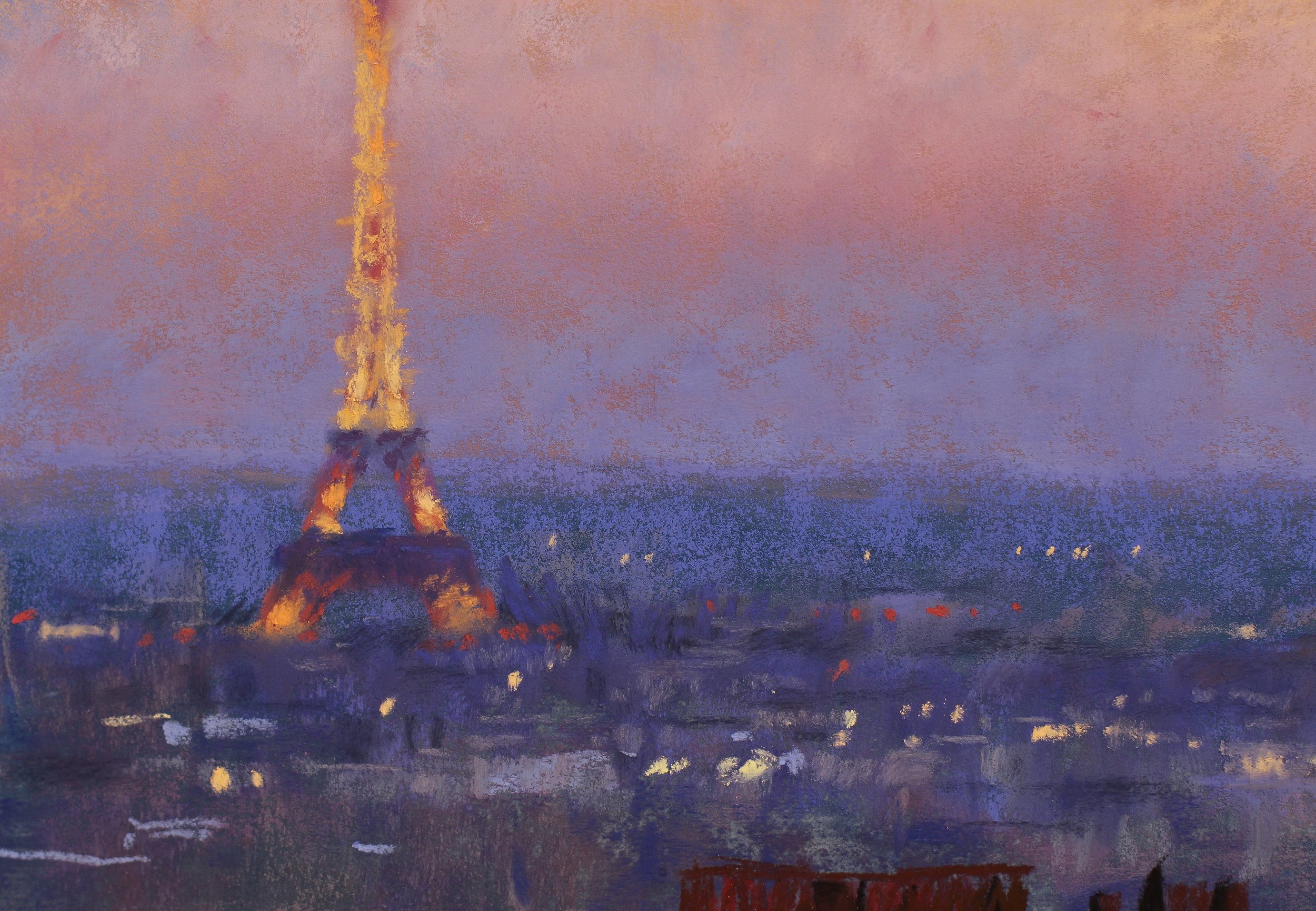
You’ll notice the color that I use for the tower is rather saturated. I want to depict the bright warm light that it’s emitting, so along with the color selection, I must be mindful of the values (how light or dark) - so I’m choosing colors that stand out and will read as bright lights in the distance because they’re lighter and more saturated than the colors of the sky and hills behind the tower. I’m also beginning to add some of the distant city lights by this point.
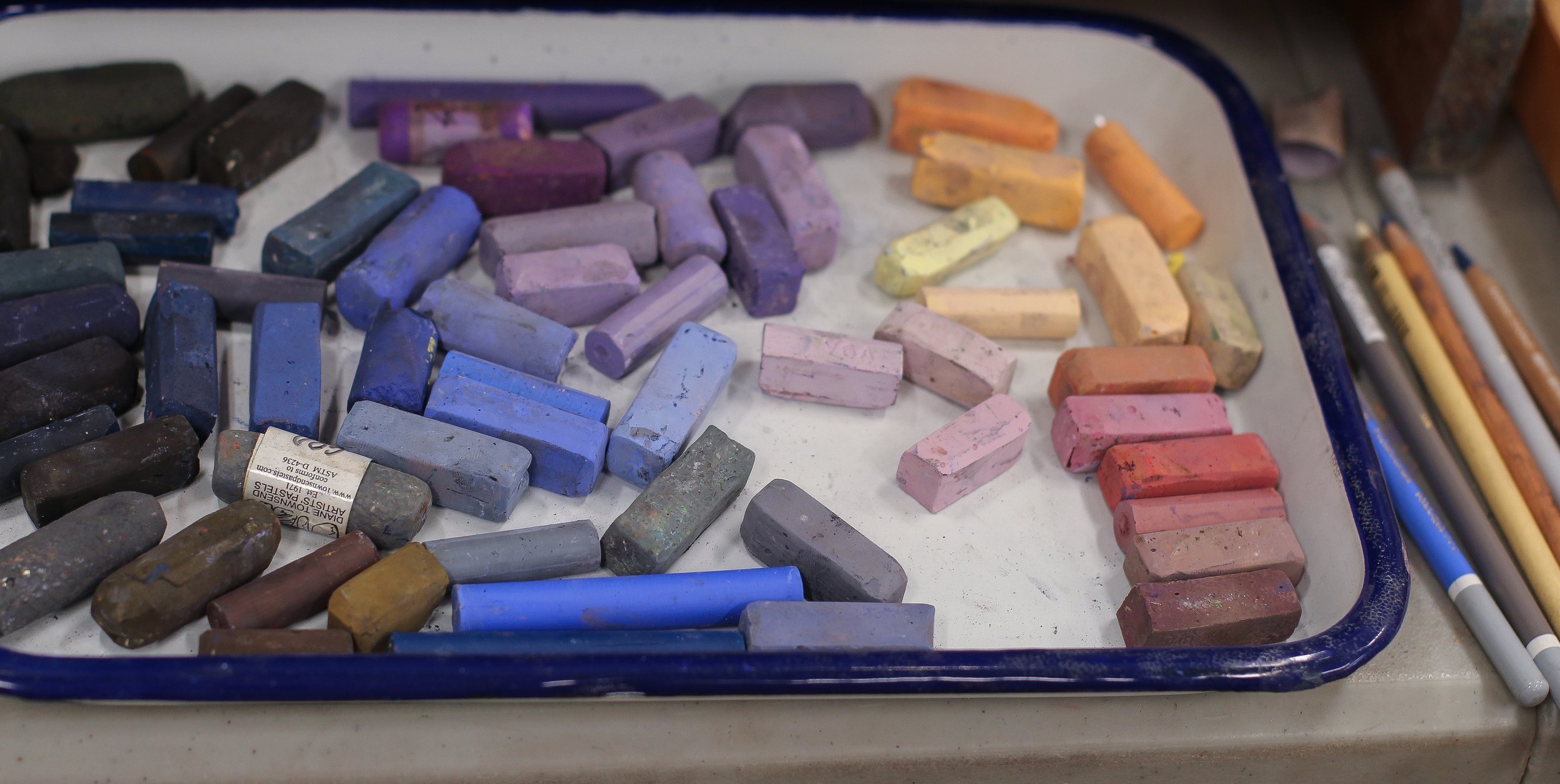
Below: My growing palette. I like to keep the colors that make it onto the painting nearby, so I’ll place them into a tray in case I want to return to them again.
STEP 5
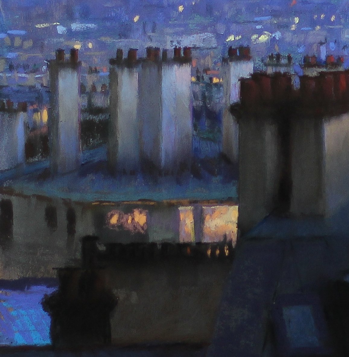
Continuing with the secondary chimneys in the middle ground, I like to block each one in with mid-value grays (or whatever value seems appropriate) and add the dark “pots” on top of each. I’ll add a layer of red to these later, but for now I lay down the grays and darks and then gently run my finger down to create a soft edge and gradient. When you add enough pigment to paper with grit like the 400 you can rub a bit without sanding off your fingerprints.
STEP 6
Here I begin to add some lights to the windows. I would have included some of the color initially, but I wasn’t sure if I’d put them in. The windows were dark in my oil study, as that’s how they were in life at that moment, but I’ve done this scene many times before, and at all hours of the day and into the night, so changing things to suit my vision didn’t seem like such a stretch.
Something that I’ve noticed when painting lighted windows, particularly when it’s not totally dark outside, is that they aren’t completely filled with light. There are still dark areas, so I’m careful to not go overboard and make them solid light. I don’t want it to appear as though the apartments are on fire inside!
ABOVE: The palette has grown warmer with the addition of my selection for the lighted windows.
BELOW: The painting has all of the necessary elements at this point. Things I’ve decided to address/develop further:
Selecting edges to sharpen and emphasize, such as the chimneys and some chimney pots. Pencils are useful for this!
The face of the foreground building is too light in my opinion. It’s getting some warm light from the street level lights (unseen) that I like, but I want to darken the wall so it’s not competing with other elements in the overall composition.
I’ll also finish the roof by adding layers of dark and some line detail.
By now there is enough pigment on areas of the painting that I can also soften edges using a light touch with my fingers.
FINAL STEPS
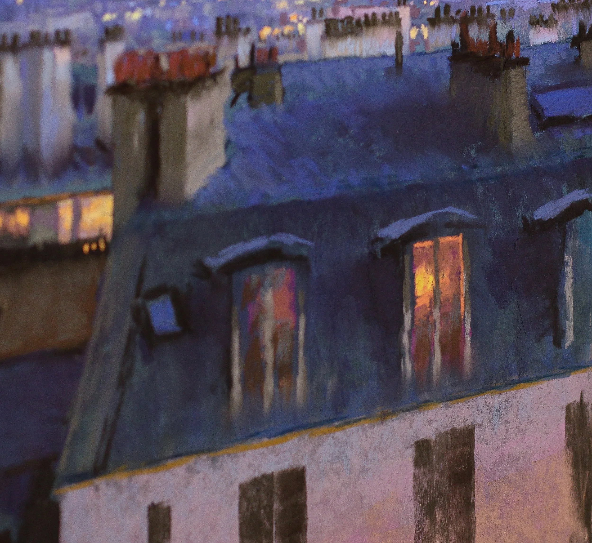
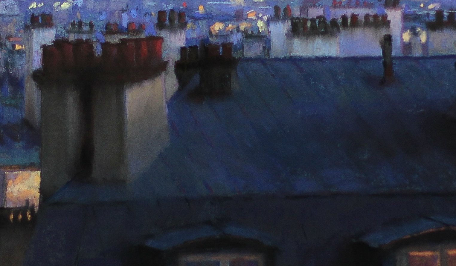
Here you can see where I’ve worked out all of the things on my aforementioned list, including layering darks on the roof -simultaneously layering and gently rubbing the color in with my fingers- and using my pencils to sharpen edges and add details like the lines on the foreground rooftops.
AND… THE FINISH!
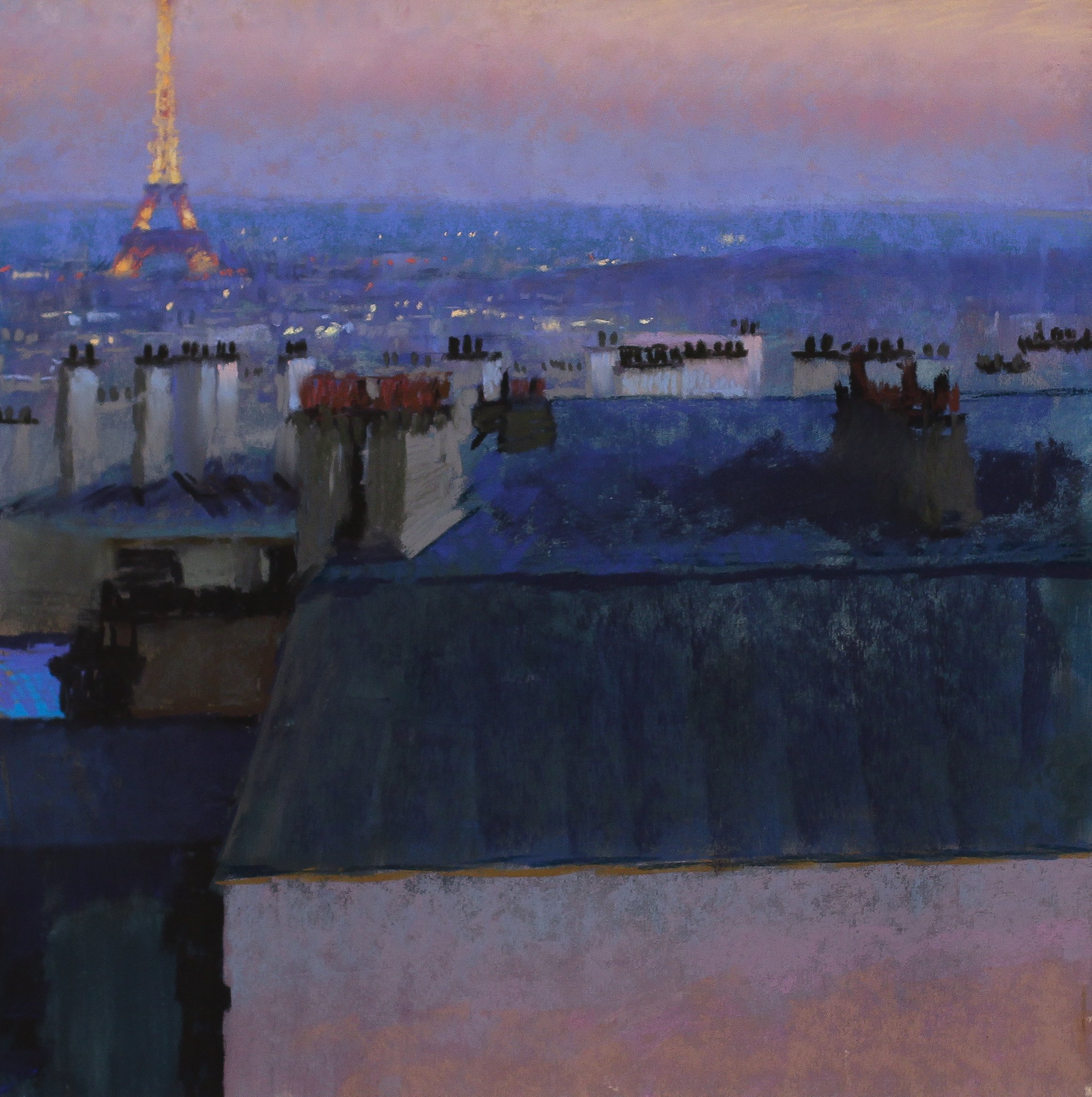
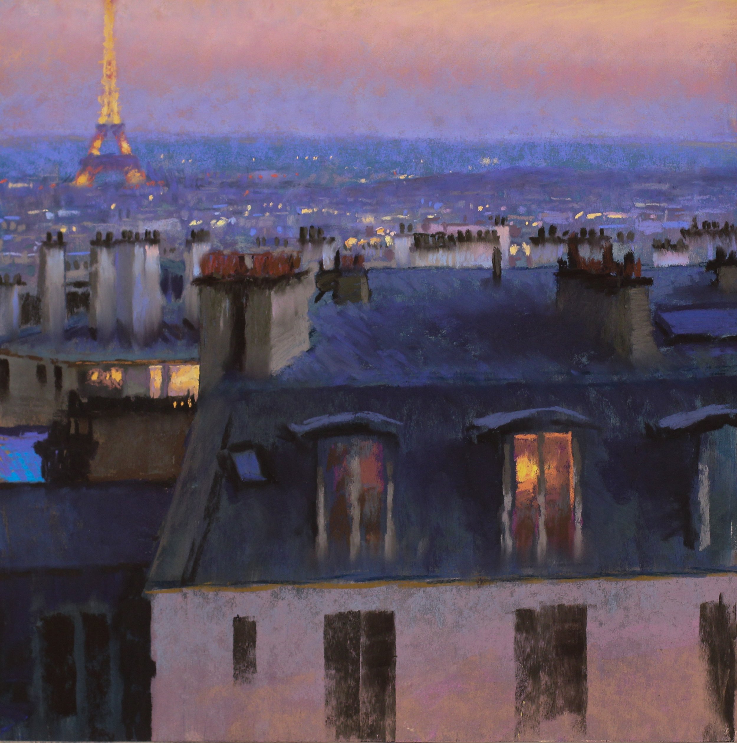
Here, you can see the final painting! After much debate with myself, I decided to add the domed building in the distance. I sometimes leave it out but it really adds to the signature view of Paris from the Montmartre neighborhood!
ABOVE: The finished painting alongside the oil study I brought back from Paris.


